The Dodo Blog
Today I'd like to talk to you about my new wet felting program. It's open for registration for another couple of days.
I created it for advanced beginners or intermediate felt makers:
- If you're feeling like you'd like to make progress, but you don't know how
- If you'd like to improve the quality ...
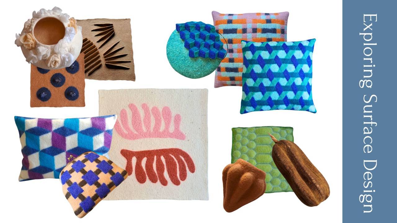
My new online program, Exploring Surface Design, is now open for registration until April 6th.
This program grew out of the evolution of The Dodo Hub into three shorter, more focused trainings. And this one is dedicated entirely to surface design.
If you’ve ever felt that your surfaces could be mo...
Today, I want to talk to you about something that makes felt makers a little bit nervous: the S word. SAMPLES!
While I know most of us would do anything to avoid making samples before we felt a piece, I’m – once again – going to try to persuade you to make them.
Now, when we talk about making sa...
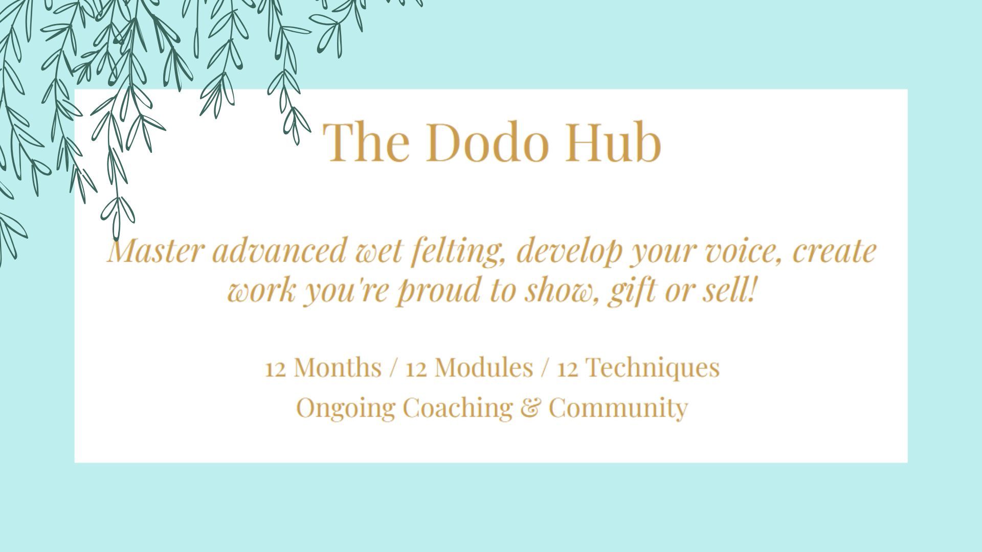
If you’ve been waiting for the registration to THE DODO HUB to open, I’ve got good news. You can now sign up here.
WHO IS THE PROGRAM FOR?
You’ve been a felt maker for some years now, but …
- you feel like you’ve reached a plateau, and you don’t know how to develop your work further;
- you wan...
We start wet felting because we’re fascinated by the material and the possibilities of creating all sorts of things, from wearables to sculpture ✨💫
We see what others are doing, so we dream of what we’d like to create. But, let’s face it, wool can be stubborn, and the initial phases aren’t easy.
...
It’s finally here, the new format I’ve been mentioning for some time!
So, what is it exactly? If you’ve been following my blog or Instagram account, you’ve heard about THE DODO HUB for sure. Chances are you're curious about TDH and you’d like to know more about it.
Since it’s a one-year program, i...
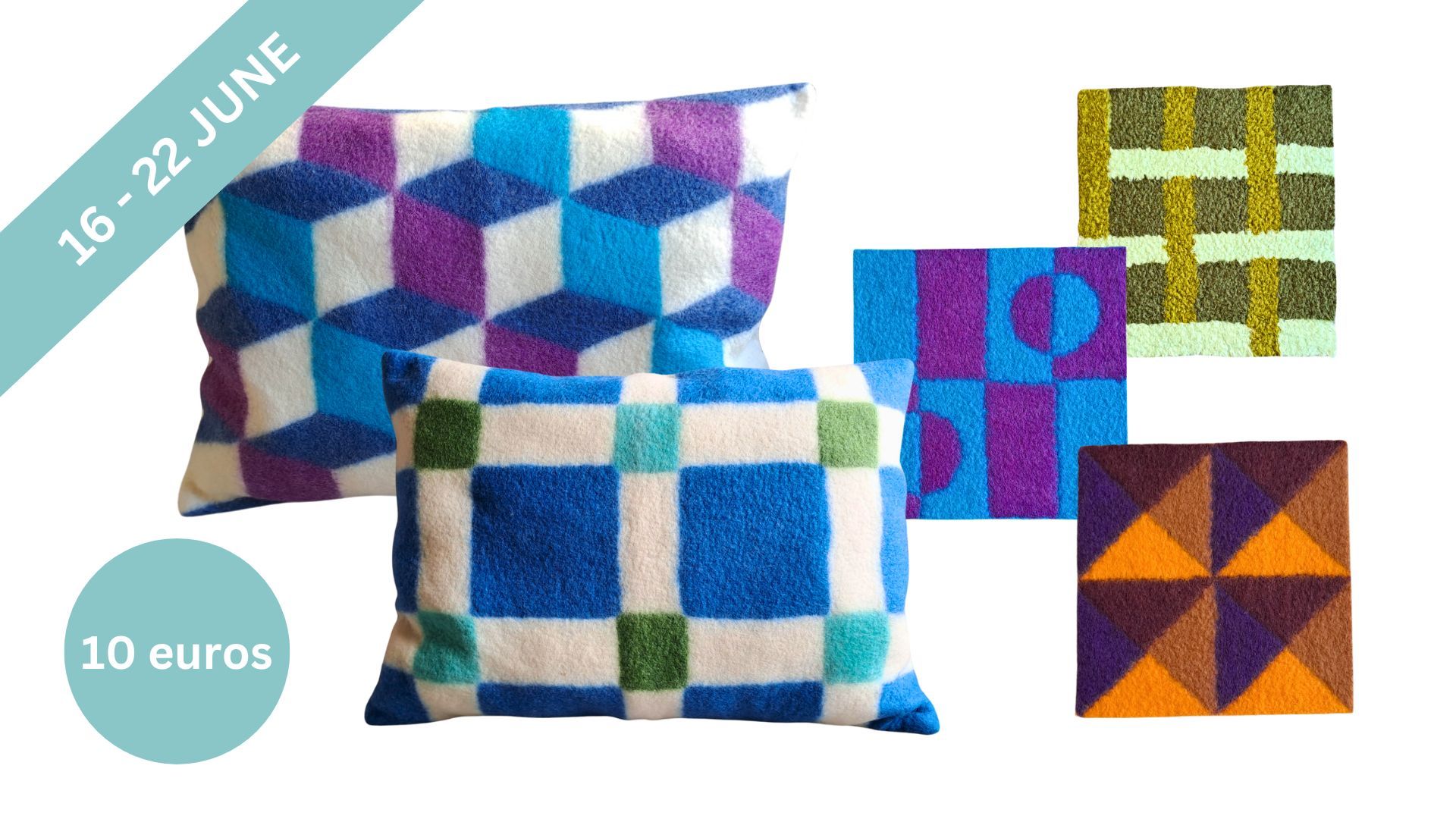
So you had a look at the program, and now you’re thinking “Yes, one technique a month. But what do we really felt inside THE DODO HUB?”
I get that it may not be totally clear to you, so let me help you with that.
First, above there's a short video of some of the beautiful pieces made by the partic...

I’m working on a new class that is meant to help felt makers go all the way (smoothly) from total beginner to intermediate. If you’ve recently started wet felting or you’ve been felting for a while, but still feel like there are many gaps in your knowledge, this may be for you.
But I’ll need some t...
When we start a new hobby, the natural tendency is to imitate someone else’s style. And there’s no reason to feel bad about it. We all do it. I did it too. When I was discovering wet felting, I had no clue how I could explore it. Following what other felt makers were doing was the only way to learn ...
